Showing posts with label flower soft. Show all posts

Tuesday, October 30, 2012

Purr-fect Copic Coloring Tutorial


The name Purr-fect is the name of the stamp from Flowersoft.  We will be using some of the newer Copic Markers in some different techniques to my site.  One of the things that we will be covering in this tutorial is the blending techniques when you don't have colors that closely similar.
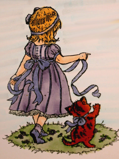
This is the finished card front.


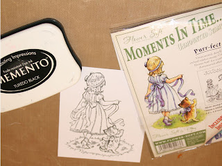
Stamp the little girl with Memento Tuxedo Black Ink on two pieces of Express It paper.


The Memento Inks will hold up to the alcohol of the Copic Markers. I'm told other dye base inks work, but I haven't found one that does yet. If you know of one, please share with me?


Using your favorite skin colors, do the face, arms and legs.  I used E000 and E00 for the sample.  I have to be extra careful that you get all the flesh areas.  I have a bad habit of missing one small spot.


Using E89 Pecan and YR27 Tuscan orange, two of the newer colors, color the cat.  Start with the YR27 and color the whole cat.  Use the E89 and color the strips, then use the YR27 to blend the hard lines out of the stripes; it is fur after all. 


Using the V22, color all areas of the dress, and socks leaving the underskirt white.  Then color the ribbon (including the one in her hair), stripes, buttons and sleeve trim and shoes with BV34.  Do the kittens ribbon and the girl’s shoes with BV34 too.  Finish the sole of the shoe with E89.  You may choose to accent your ribbons with clear Stardust pen, this gives it a nearly satin look, and is really attractive.

NEW TECHNIQUE
The darker colors will build up colors each time you go over an area.  We are giving the areas plenty of time to dry in between applications, so the buildup will be dark enough to serve as a shadow.  You will color any areas around the waist, sleeves and skirt with the V22 that already have crease lines in them.  This will shade those areas.  You will also shade areas or the dress around the ribbon belt where it would naturally shade the dress, and any low spots in the skirt.  You may blend the harsh lines in the skirt areas, but it isn't necessary.  

Using the Y23, color all of the hair.  Using E55, shade the areas that are naturally shaded in the picture.  

Blend the shadowed area, by flicking the Y23 into the dark shaded areas.  Don't do this a lot. Just blend enough to soften any hard lines.
I enhanced the images of the hair and ground a lot to show you where the color differences are.  This was before I blended the colors.

Using one more of the new colors G43 Pistachio, color the grass.  Using BV34 and V22 color the flowers in the grass.  Now is a good time to take a break and shop or go to the restroom.  Now use the G43 to shade the areas around the girl and kitten.  

Use the finished picture as the example for the background.


Background Colors are V01 Heath, B000 Pale Porcelain Blue, BG000 Pale Aqua, N1 Natural Gray No. 1.  This is a combo that I use a lot.  I did add one of the new colors to this BG90.  This is light enough, and in evidence in the actual artwork we have created.  Using a long flicking motion, starting at the edge of the image, flick color away from the picture in one fluid motion all the way to the edge of the card stock.  It won’t matter if you get into the dress at all, but be extra careful around her hair and the Kitten, as you will drag that dark color into the background and that is undesirable. I don't take the background any further than the grass area. Remember the colors are darker when wet, and will lighten as they dry.  

I used Tim Holtz Antique Linen Distress Pad on the entire image to give it an antique look.  When I put it on the card I distressed it even more on the edges.

I used this image in a birthday card for my niece.  She loved the card, and I loved doing it.  I hope you enjoy the tutorial.  The photos weren't my best yet, but I'm getting much better.  I did this one a while back for a class at my local scrapbook store.

Hugz, Peace and Blessings.

Namaste,
Lynne


Wednesday, August 24, 2011

Longtime No See


Have been neglecting this page for too long. Decided to share some cards that I made recently. I have had a blast with these.

This is a Great Impressions stamp called Hydrangea, I stamped it with Versamark and embossed with black. I used Copic Markers to add colors, and stickles, which actually cause some cool color changes in the markers. Used gold embossing on the edges by dragging the card edge directly through the Versamark. I stamped and colored extra hydrangeas, and used foam dots to place them over the matching flowers on the main card.


This is another Great Impressions Stamp. I used Copics for color, and Sakura Stardust and jelly rolls for shimmer effects. I used Flower soft on some of the flowers and the centers of the sunflowers. I stamped and colored extra butterflies, cut them out and applied glue just to the bodies of the butterfly and placed them directly over the butterflies on the card.


Yes another Great Impression Stamp, done with copics and flowersoft. I cut this into three one inch panels and matted it with a 1/8 inch border. It was a direct take off of one that was part of the Great Impressions demo board at The Scrapper's Place in Findlay, OH.

I have been experimenting with the Copics and have to say I just love them. The colors and techniques that you can acheive with them are superior to other markers.


I bet you will never guess what company did this stamp, and what I colored it with. LOL Great Impression and Copics.