Wednesday, January 2, 2013

Uncaged Birdday Card

I know I have been gone for a while, and then all of a sudden I have a bunch of cards up. 2012 was not a great year for my family. It started right out in January with moving from the farm, and while in that process my mother passed away. She was 94, and ready to go, so she did.

My daughter, who is 41, did not take her death very well. She has epilepsy, and her seizures were pretty much under control prior to this event. During the funeral she started having lots of seizures, and nothing seemed to stop them anymore. She started out trying lots of medications, but nothing helped.  She finally went to the Cleveland Clinic for evaluation for the first time in September, and she underwent many tests, and many hospital visits and about 4 weeks of hospital stays to determine whether she would be a good candidate for surgery. She was a good candidate, and she had the surgery December 7, 2012. So far, she is seizure free. She is no longer in need of close watch, and she is in really good spirits. The surgery seemed to be a piece of cake for her, and we attribute this to her courage and her great surgeon Dr. Jorge Gonzalas-Martinez.  We had a wonderful and blessed Yuletide Season, with much celebration.

This year will be much different I'm sure.  It is already getting off to a nice smooth start.  The house is in order, and as organized as I every get when I'm creating.  At least I can put my hands on everything I want to use, and I'm finding things I thought were gone for good.  All the excitement made it impossible to get my stuff unpacked after the move, and by the time I got around to it I had forgotten where things had been placed:(.
 
Now to describe the card.  I made it with a view to putting it on the Color Throw Down site, and I intend to do that.  However, I've found several other places that I can use it in a challenge.
 
The papers are all from Stampin' Up, as are the inks.  I used McGill Punches Birch Leaves for the leaves, and I Am Roses roses.  I used Lindy Stamp Gang Mission Bells Brown Starburst Spray to highlight them after applying Soft Suede ink to the tips.  Unfortunately you can see the pretty shimmer on the roses in any picture that I have taken (I gave up.)  I used a Spellbinders die Fancy Labels One to cut out the sentiment.  The Bird Cage and Bird are from Tim Holtz for Sizzix called Caged Bird, however, I didn't cage mine.  I think that pretty much sums up the materials.
 
The leaves were quite flat when I cut them, and I didn't think they looked good with the flowers, so I did some bending and folding.  I folded the leaf in half, the hills are all on the front side.  I then just pinched some creases in the edges with my fingers.  They turned out far better than I would have thought.  I distressed them with the Soft Suede Ink I used on the flowers and other edges on this card.
 
Here is the recipe for this card from Color Throwdown.  Let me know what you think by leaving a comment.  I hope you enjoy.
 
Namaste

Zorana the Dancing Gypsy

Zoranna the Dancing Gypsy
I just fell in love with this stamp from Saturated Canary Digi's.  I wasn't sure what I was going to do with her.  The image was colored with Copic Markers on Copic Express It Paper.  I found this paper at The Paper Shelter, and decided that if fit with my thoughts for the girl.  I just got some new shinys from Lindy Stamp Gang, and love that stuff.  No end of things I'm likely to do with that.  I also FINALLY got my Cheery Lynn big die to work, and used the inside of the die for the sentiment star.

The stamps are all from Stampin' Up.   The flowers I have forgotten where I got them, but I did stamp on them with a bit word stamp.  I used the McGill Flower Punch Birch Leaf with the flower.

I just found this card fun to put together. It was an experiment with new colors and combinations that I hadn't used before.  I hope you like it.

Hugz, Namaste

Challenge entries:

http://pennyschallenges.blogspot.com/  Ends 1/9/13
http://sparklesforumchallenges.blogspot.com/2012/12/challenge-39-anything-goes.html


Tuesday, January 1, 2013

Gus N Stella and Free Paper Download

This is a digital stamp that I got from Bugaboo Digi Stamps.  I just love these two characters, as their attitude reminds me a lot of my husband and I.  We pick on each other good naturedly, but their is always a grain of truth in our statements.  On Christmas day we were driving to the son's house, and we had a bit of difference about something which I can't even remember.  He just could not grasp what I was saying, because he was too busy formulating his next remark and not really listening to what I had to say.  For my part, I was just NOT going to drop the subject until he LISTENED to me.  LOL.  He said, "Why is it that you start this shyt when we are in the car?"  She said, "Because I know I have a captive audience, and I hope you will listen for once and get the real meaning instead of what you just think I was saying."  The bold, italics, underlined words were said with MUCH sacasm.

So the next day, as I was looking at the Bugaboo Digi Stamps site, I spoted Stella and Gus Marriage.  They were looking a lot like my hubby and I this morning over our coffee.  The caption originally said, "Husbands should come with a set of instructions. and Wives should come this mute buttons"  We would joke, while pointing the TV channel changer at each other and pressing the brightness button, that the brightness button just didn't work because the person in the line of the channel chager was not getting any brighter.  Does anyone really remember these channel changers?  Now all that stuff is just taken care of by the TV.  At any rate, this is where the captions come from.  I really would like to make him much brighter, and he would really like to mute me sometimes when we are in the car and he is my captive audience.  LOL 

So I made him this card to apologize for the uncomfortable ride. ROFL  I whited out the original captions, and used Photoshop to creat the captions that are now on the front, bottom of this card rather than in the captions that were on the original graphic.  I used Photoshop to color the digi stamps.  I created my own patterned cardstock using the colors that I used to color Stella, Gus and the cups.  I printed this all on Gina K Layering Weight Cardstock*. 

I used a Martha Stewart Punch called Double Loop Punch Around the Page to creat the border. The banner flags were hand cut.  I made my card base from Gina K Heavy base weight card stock*.  I used Memento Tuxedo Black ink to destress the white image of Gus and Stella.

I hope you enjoy the card.

*Just a note here about Gina K's cardstock; it is the nices stuff for printing on an ink jet and actually using Copic Markers to color the image.  I like the way it works.  The Heavy Base Weight makes a good sturdy card, that does not crack when folded and creased with a bone folder.

Here is the paper for the card.  Feel free to download the image for your own use.  Just right click and "Save Picture As".

Challenge List:

C.R.A.F.T Challenge
Crafty Creations Challenges

Tuesday, October 30, 2012

Purr-fect Copic Coloring Tutorial


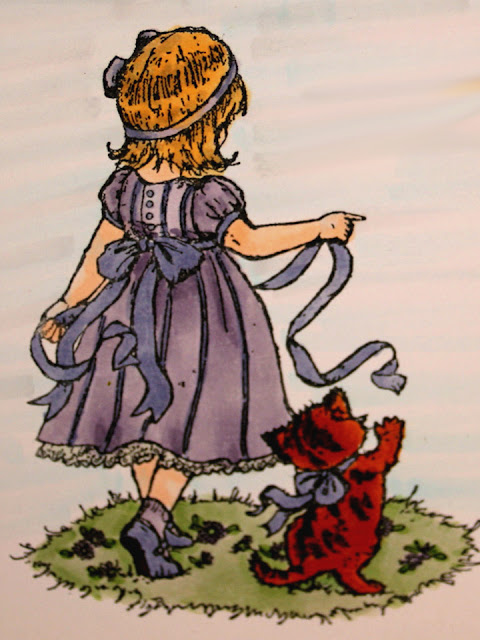
The name Purr-fect is the name of the stamp from Flowersoft.  We will be using some of the newer Copic Markers in some different techniques to my site.  One of the things that we will be covering in this tutorial is the blending techniques when you don't have colors that closely similar.

This is the finished card front.


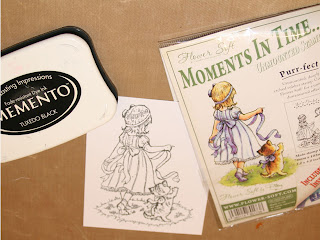
Stamp the little girl with Memento Tuxedo Black Ink on two pieces of Express It paper.


The Memento Inks will hold up to the alcohol of the Copic Markers. I'm told other dye base inks work, but I haven't found one that does yet. If you know of one, please share with me?


Using your favorite skin colors, do the face, arms and legs.  I used E000 and E00 for the sample.  I have to be extra careful that you get all the flesh areas.  I have a bad habit of missing one small spot.


Using E89 Pecan and YR27 Tuscan orange, two of the newer colors, color the cat.  Start with the YR27 and color the whole cat.  Use the E89 and color the strips, then use the YR27 to blend the hard lines out of the stripes; it is fur after all. 


Using the V22, color all areas of the dress, and socks leaving the underskirt white.  Then color the ribbon (including the one in her hair), stripes, buttons and sleeve trim and shoes with BV34.  Do the kittens ribbon and the girl’s shoes with BV34 too.  Finish the sole of the shoe with E89.  You may choose to accent your ribbons with clear Stardust pen, this gives it a nearly satin look, and is really attractive.

NEW TECHNIQUE
The darker colors will build up colors each time you go over an area.  We are giving the areas plenty of time to dry in between applications, so the buildup will be dark enough to serve as a shadow.  You will color any areas around the waist, sleeves and skirt with the V22 that already have crease lines in them.  This will shade those areas.  You will also shade areas or the dress around the ribbon belt where it would naturally shade the dress, and any low spots in the skirt.  You may blend the harsh lines in the skirt areas, but it isn't necessary.  

Using the Y23, color all of the hair.  Using E55, shade the areas that are naturally shaded in the picture.  

Blend the shadowed area, by flicking the Y23 into the dark shaded areas.  Don't do this a lot. Just blend enough to soften any hard lines.
I enhanced the images of the hair and ground a lot to show you where the color differences are.  This was before I blended the colors.

Using one more of the new colors G43 Pistachio, color the grass.  Using BV34 and V22 color the flowers in the grass.  Now is a good time to take a break and shop or go to the restroom.  Now use the G43 to shade the areas around the girl and kitten.  

Use the finished picture as the example for the background.


Background Colors are V01 Heath, B000 Pale Porcelain Blue, BG000 Pale Aqua, N1 Natural Gray No. 1.  This is a combo that I use a lot.  I did add one of the new colors to this BG90.  This is light enough, and in evidence in the actual artwork we have created.  Using a long flicking motion, starting at the edge of the image, flick color away from the picture in one fluid motion all the way to the edge of the card stock.  It won’t matter if you get into the dress at all, but be extra careful around her hair and the Kitten, as you will drag that dark color into the background and that is undesirable. I don't take the background any further than the grass area. Remember the colors are darker when wet, and will lighten as they dry.  

I used Tim Holtz Antique Linen Distress Pad on the entire image to give it an antique look.  When I put it on the card I distressed it even more on the edges.

I used this image in a birthday card for my niece.  She loved the card, and I loved doing it.  I hope you enjoy the tutorial.  The photos weren't my best yet, but I'm getting much better.  I did this one a while back for a class at my local scrapbook store.

Hugz, Peace and Blessings.

Namaste,
Lynne


Friday, October 26, 2012

Fall Boxed Card Set

I would normally worked to remove the glare from this picture, however, I wanted to assure that you realized that this is semi-gloss presentation paper.  I got this at Staples and just love it for this type of card.  This was the freebie from Silhouette for Octover, but works great for the Thanksgiving Holiday as well.  This is a box of six (6) identical cards, in a matching box.  These are great for hostess gifts, and can be done in any variation.  I've made mixed greeting cards,  and boxes of holiday cards.

It is simpler to make a whole box of cards in the same style.  I have made some what I call owner's choice cards.  I make six cards that will be good for multiple occassion.  Like flowers that work for birthday, sympathy and get well cards.  Sometimes they work for Mother's Day.  I also will make a box of masculine type cards, and make sure they are generic enough to work for multiple occassions.  Everyone can use more masculine cards. 

I then will create greetings and inside sayings for all occassions that suit the card art.  I use the Silhoutte Cameo to print and cut them.  I add double sided tape and/or pop dots to the word art cut-outs, and give instructions on how to place them on the cards.  They are really a hit, as you never can guess just what cards you may need during the year.  This way, you have just what you need.

The box instructions came from GinaK and can be found HERE.  The cardstock is GinaK heavy base weight cardstock, and I forgot the color name.  Her cardstock is so nice, and a good price.  I love to use it for cards, and boxes, as they fold without looking nasty, as cheap cardstock can sometimes.  It also has a nice heft to it which screams premium without the premium price.  She also has a layering weight that is great for stamping and layering similar to how I did the oval Greeting Card embellishment.

All the cards in this example are exactly the same.  I left the inside plain, so the giver may write their own note, and wishes on the inside.

I hope you enjoy.

Tuesday, October 2, 2012

Cricut Ornament Card


I needed to feel like it was justified for me to have one Cricut let alone two, so here is a project I worked on all weekend.  I finally decided I like the Cricut Classroom.  It took a very long time for me to think it deserved a second chance though.  The beauty of this project is that you could cut all the pieces at one time, and then build the cards while you watched TV.  The longest part of this process was picking the coordinating papers.  The design and stuff were all in the magazine.  I just love these.  I did several different types for variety, but for a gift one design is enough.  The assembly goes really quickly.

I used the instructions out of the Northridge, Cricut Magazine. 

I used the Winter Frolic Cartridge, Ornament 1 and the Cricut Classroom.  I did these all proportional, based on placing the pieces over each other to see how they fit.  I used the Shadow, copied it, and Flipped one 180° degrees.  I lined the up with the ornament tops aligned to form a card, and welded them together.  Make sure that you have the whole piece selected before you fill the page.  I found that about four would go on one page if you flipped one welded assembly 80° on its side.

I added as many layers as I needed for the whole project. 

I used the Ornament 1 just a bit smaller than the shadow, and filled a pages with it.  This is the layer on which I used the shiny paper.  Leave the hook on this one.

Next I made another Ornament 1 just a little smaller than the previous Ornament 1.  I cut the hook off of one of the ornaments to prevent an overlap.  Now I wish I had kept the metallic hook though so that is why I say cut this off here.

I used the Happy Holiday Greeting from Winter Frolic along with the shadow, which I did in white, for the first card and just the Greeting for the second one. I like having the white behind that as it makes it pop.  I used distress ink in Tea Stain from Tim Holtz.  I used this on some of the ornament pieces, but didn't see much difference so stopped doing that.  It really depends on what colors and designs you use whether you want to bother with this step or not.

I cut them all in different matching cardstock & paper patterns, but made the middle a shiny piece. 

I used the Language of Friendship, Stampin' Up stampset to make the bird and branches, and used the matching punch to cut is out.  I used scraps of the paper from which the ornaments were cut for the stamping and punch, which made minimal waste on this project.

 I used prima flowers and gems to finish the decoration.
 
These would make a cute gift if placed in a decorative box..There are plenty of tutorials on this all over the web.  I really like to SplitCoast Stampers sight for that.
 
I hope you enjoy.
 
Namaste

Saturday, August 11, 2012

Crane Birthday Card


I made this card using bits and pieces of paper I had left from other projects.  It is a good card for both men and women.  If I had more of the images I would have made a bunch of them.  However, I have some other images from this paper collection that will work just as well.

The crane image came from Komodo, Inc called Winter Waves.

Happy Birthday stamp is from My Favorite Things
Love stamp from Chronicle Press, Art of Chinese Chops Set

I cut a 5 1/2  inch by  8 1/2 inch piece of Stampin' UP Nearly Navy card stock, and folded it to make a 5 1/2 by 4 1/4 inch card.

I used a scrap of textured light beige card stock, and I can't remember the mfr.  I cut this to 5 1/4 by 4 inches.

I cut the Crane image to 5 by 3 3/4 inches and adhered it to the textured card.

I wrapped a navy May Arts 1/4 inch wide ribbon around the bottom of the card.  I adhered the artwork with the ribbon onto the folded card.

I stamped my images on a light beige card stock that matched the artwork.  This is a Gina K design layer weight 70#, but for the life of me I can't remember the color name.

I cut the chop out, just on the outside of the red rim, and adhered this with dimensional adhesive foam.  I placed it below the ribbon in an attractive location.

I stamped the greeting, and punched it out with a Stampin' Up Oval punch.  I used dimensional foam to place it just above the ribbon in an attractive location.

Once the stamped images were in place, I centered the ribbon between the two stamped images, and adjusted the bow in an attractive position relative to the Crane image and raised stamps, and used a glue dot to fix the bow in place.

I stamped another birthday greeting on the beige card stock, punched it out with the oval, and adhered it to the inside of the card.

I hope you enjoyed, thanks for looking.

Namaste