Showing posts with label Copic Marker. Show all posts

Monday, March 11, 2013

Steampunk Lime Fog plus Free Stuff


Welcome to the blog crawl, I hope you enjoy the visit. See the links to the other participants at the bottom of my post.

Gray Bicycle Birthday Card
Dressform and Gentlemans Perspective with Butterfly

This is the Steampunk Lime Fog
This is the inside sentiment. The frames match the color scheme of the card.
I did several renditions of this theme. I had some interesting colors come out of the combinations that I chose for this steampunk escapade. The first card I did had such unusual colors for the scalloped border, and flowers that I almost threw it out. The my daughter, who is taking Graphic Design at university, said she loved the color because it was so eye catching. I have to admit, it is Loud. I decided to share it here with the two that I liked.


I have created the papers, color swatches, and some of the cut files for this masculine birthday card. I had such a great time with the Steampunk Bizarre Brushes by Hogret that I found here.  I cut the flowers from the Silhouette Store on my Cameo.  The leaves and borders I created in my Silhouette Cameo Designer Edition software and cut with my Cameo, here are the links to the cut files: Leaves and Border. I also used a chipboard butterfly that I sprayed with Lindy Stamp Gang Starburst Spray in Yellow Rose of Texas which you can find here.

The inside sentiment is made by my using Some Weatz Swashes which I got here. I used a frame/label from the Silhouette Store, which I adapted heavily to meet my needs. I colored the frame using the swatch that matched the card front.

I am linking one of the posts that used on how to add patterns to your Silhouette, for both the designer edition and the regular edition.  It is really quite simple once you know the trick. Here it is.

I used my Photoshop to print the Digi Paper that I have as the background to the card.  I used the print and cut feature of the Silhouette Cameo to cut the scalloped border, leaves and greeting. What is interesting is that you can fit all the embellishment for one card on one piece of 8.5x11 cardstock. I use the Copic Express It card stock (CS), which I buy at Amazon when it is on sale, find it here. The X-Press It Paper is really high quality, but isn't too thick. It is between 70-80#, which makes it ideal for manipulating the rolled glowers, but sturdy enough to make a great card in a pinch. The printed colors on this stay really sharp and bright, which does not happen with cheap CS. I've tried some cheaper cover papers, and those have very limited capability as they are generally 65# or less.  The could not be a good quality card base.

The Digi Patterns can be used on the silhouette per the instructions in the linked video.  These are 300 pixels per inch, and can be printed for paper also. See my paper choice above.

If you have any questions please let me know. Comments make my day. Enjoy.

Namaste

Steampunk Yello n Lime Pattern and here it is free


Steampunk Gray n Yello Pilot Pattern and here it is free

Steampunk Lime Swatch and here it is free


Steampunk Yello Swatch and here it is free
Steampunk Graybull Swatch and here it is free


Friday, January 18, 2013

Butterfly in Yellow and Grey

This is another Study in Yellow and Grey from Elka Romero Designs, I printed the designs on cardstock and then cut it to the size that I needed.  I used white cardstock from my stash, and I know it is a cheapy brand, as the colors are more muted than on the other cards.  I did that on purpose, as I wanted a more muted color scheme for this card, as the butterfly is the feature of the card.  I used prima pearls colored with a N7 Copic Marker.  The butterfly is by SEI I think.  The tag punches are by Stampin' Up as is this ribbon and black ink.  The flowers are a Tim Holtz Tattered Florals die by Sizzix and the leaf is a Birch Leaf by McGill.

This was a quick card once the printing was complete.

Thanks for coming by.
Namaste

Tuesday, October 30, 2012

Purr-fect Copic Coloring Tutorial


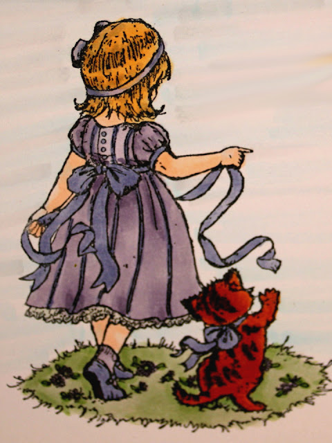
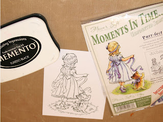
The name Purr-fect is the name of the stamp from Flowersoft.  We will be using some of the newer Copic Markers in some different techniques to my site.  One of the things that we will be covering in this tutorial is the blending techniques when you don't have colors that closely similar.

This is the finished card front.


Stamp the little girl with Memento Tuxedo Black Ink on two pieces of Express It paper.


The Memento Inks will hold up to the alcohol of the Copic Markers. I'm told other dye base inks work, but I haven't found one that does yet. If you know of one, please share with me?


Using your favorite skin colors, do the face, arms and legs.  I used E000 and E00 for the sample.  I have to be extra careful that you get all the flesh areas.  I have a bad habit of missing one small spot.


Using E89 Pecan and YR27 Tuscan orange, two of the newer colors, color the cat.  Start with the YR27 and color the whole cat.  Use the E89 and color the strips, then use the YR27 to blend the hard lines out of the stripes; it is fur after all. 


Using the V22, color all areas of the dress, and socks leaving the underskirt white.  Then color the ribbon (including the one in her hair), stripes, buttons and sleeve trim and shoes with BV34.  Do the kittens ribbon and the girl’s shoes with BV34 too.  Finish the sole of the shoe with E89.  You may choose to accent your ribbons with clear Stardust pen, this gives it a nearly satin look, and is really attractive.

NEW TECHNIQUE
The darker colors will build up colors each time you go over an area.  We are giving the areas plenty of time to dry in between applications, so the buildup will be dark enough to serve as a shadow.  You will color any areas around the waist, sleeves and skirt with the V22 that already have crease lines in them.  This will shade those areas.  You will also shade areas or the dress around the ribbon belt where it would naturally shade the dress, and any low spots in the skirt.  You may blend the harsh lines in the skirt areas, but it isn't necessary.  

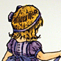
Using the Y23, color all of the hair.  Using E55, shade the areas that are naturally shaded in the picture.  

Blend the shadowed area, by flicking the Y23 into the dark shaded areas.  Don't do this a lot. Just blend enough to soften any hard lines.
I enhanced the images of the hair and ground a lot to show you where the color differences are.  This was before I blended the colors.

Using one more of the new colors G43 Pistachio, color the grass.  Using BV34 and V22 color the flowers in the grass.  Now is a good time to take a break and shop or go to the restroom.  Now use the G43 to shade the areas around the girl and kitten.  

Use the finished picture as the example for the background.


Background Colors are V01 Heath, B000 Pale Porcelain Blue, BG000 Pale Aqua, N1 Natural Gray No. 1.  This is a combo that I use a lot.  I did add one of the new colors to this BG90.  This is light enough, and in evidence in the actual artwork we have created.  Using a long flicking motion, starting at the edge of the image, flick color away from the picture in one fluid motion all the way to the edge of the card stock.  It won’t matter if you get into the dress at all, but be extra careful around her hair and the Kitten, as you will drag that dark color into the background and that is undesirable. I don't take the background any further than the grass area. Remember the colors are darker when wet, and will lighten as they dry.  

I used Tim Holtz Antique Linen Distress Pad on the entire image to give it an antique look.  When I put it on the card I distressed it even more on the edges.

I used this image in a birthday card for my niece.  She loved the card, and I loved doing it.  I hope you enjoy the tutorial.  The photos weren't my best yet, but I'm getting much better.  I did this one a while back for a class at my local scrapbook store.

Hugz, Peace and Blessings.

Namaste,
Lynne


Thursday, November 24, 2011

Butterfly the Beauty


The recipe is:
  • Ribbon-I used Mizuhiki paper cord ribbon, but you can't see it very well as it is behind the flower and is cropped by the program.
  • Layers-I used a decorative paper on a white card that was distressed with Vintage Photo by Ranger, then a top note die cut.
  • Image-I used the Hampton Arts Stamp that goes with the Graphic 45 Once Upon a Springtime, and used Copic Markers to color the Fairy.
  • Brad to hold the ribbon and flower together.
  • Patterned paper from Graphic 45 Steampunk Debutant
I love the Graphic 45 papers, and the grunge and steampunk art.  Vintage and shabby chic also have a place in my designs.